Data Input
Once you have the data ready, you can input the data in multiple ways
1. Use Sample Data
This is sample data for lectins which is made public by the NCFG. This sample data can be used if you would like to play with the interface and get used to how to use it.
To select this data, you use a dropdown menu ![]() which can be searched for data as shown in the video below.
which can be searched for data as shown in the video below.
2. Load Your Own Data
To load your own data, you can either input one file at a time, or you can input multiple files.
Note that none of this data is uploaded anywhere, it is just “loaded” into your browser, which should ease data privacy concerns.
A] From Single Files
To load a single file:
- Click on
 button.
 - Under the Using a Single File section, click on
 .
. - Browse for the input file of your choice and click on “Open“.
- Add a title for your Data in the text field (this is required).

Note avoid using spaces in your data titles as it may cause issues in data filtering. Use underscores instead. - Select the color for your data as explained below in this article. By default, a random color is generated. However, this can be disabled, and custom colors can be selected as well.
- Your data can either be visualized using the
 button in Stage 1 or added to selections using the
  button.
B] From Multiple Files
Note: If you are inputing multiple files, the data will directly be added to selections which can be used for stage 2 visualizations only. No Bar Charts will be produced, but a grouped bar chart can be produced.
Note: Avoid using spaces in filenames and Data Titles as it may cause issues in data filtering.
To load data from multiple files:
- Click on button.
- Under the Using Multiple Files section, click on and select multiple files to open.
- If the option to “Use filenames as the Data Titles” is checked:
- a prompt will popup asking you to confirm adding the files to the selections, and the files will be added to selections immediately once you click on OK.
- If the option to “Use filenames as the Data Titles” is unchecked:
- a prompt will popup asking you to confirm adding the files to the selections. When you click OK it will ask you to input the title for each file.
- By default, a random color is generated based for each data file. However, this can be disabled. Custom colors can be selected for multi-file loading after they are loaded in, using the
 .
.
Colors
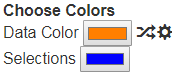 The GLAD tool has two main colors:
- Data Color
- Selections Color
and an option to Change Sample Colors later.
The Data Color
This is the color which will represent a particular data sample. It will be used to color the labels for the Data Titles and for the nodes in Force Graphs. Therefore, it is important to choose colors which the user can relate to.
This color is associated with the data when it is loaded. Therefore, the color must be set before loading in the data file.
The GLAD tool uses SwitchColors.js script to randomize colors.
By default, the GLAD tool randomizes the color every time new data file is loaded into the system. However, this can be disabled under the settings by clicking on ![]() settings cog and then unchecking the “Auto Switch Data Colors” option. This can be useful, if you are loading groups of similar data files which you would like to be highlighted using a single color.
settings cog and then unchecking the “Auto Switch Data Colors” option. This can be useful, if you are loading groups of similar data files which you would like to be highlighted using a single color.
The randomize icon ![]() next to the color input field will change the Data color in a random manner.
next to the color input field will change the Data color in a random manner.
The Selections Color
This color is only used to highlight the selections in bar charts. It is less essential to change this, however it can be changed if it becomes difficult to see the selections being made in the bar charts due to a conflict in the color of the bars (the Data Color).
Change Sample Colors and Names Button
The ![]() button, allows you to change the sample colors or the sample names (Title) for data which is added to the selections. This way, the user can change the sample names and colors later if they feel for some reason they need to represent a particular data set in a different color.
button, allows you to change the sample colors or the sample names (Title) for data which is added to the selections. This way, the user can change the sample names and colors later if they feel for some reason they need to represent a particular data set in a different color.
Note that the changes made using the Change Sample Colors and Names drop down will only occur for Stage 2 visualizations.