Correlation Maps allow users to compare the similarity (or difference) between samples and glycan binding. To do this, GLAD calculates the Pearson Correlation Coefficient (r) for the set of sample and glycans. The calculated r-value is then transformed to a color gradient and presented as a heatmap to the user.
Within the correlation map, a scatterplot can be produced between two samples in order to compare the data.
Bland-Altman difference plots are also drawn version 1.1 onwards.
Create a Correlation Map
Note- to draw the correlation maps, a minimum of 10 data points must exist. Ideally, one must have >25 data points for the correlation map to be believable.
To create a correlation map:
- Make sure you have loaded your data.
- Check the settings by clicking on the
 .
. - Click on the
 to create the correlation map.
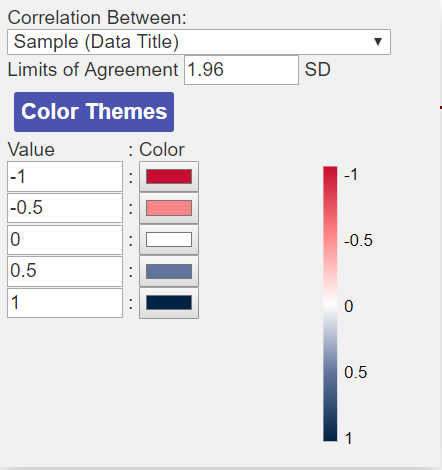 Correlation Map Settings
Like the Heat Map, the Correlation Map colors scheme can be changed and customized. The color schemes are divergent as the correlation maps range in value from -1 to +1.
You can also choose to perform the correlation between either Samples or Glycans.
The limits of agreement for the Bland Altman Analysis can also be set. By default this is set to 1.96 standard deviations (SD) but this can be changed depending on how tight the user would like this.
Navigating a Correlation Map
The correlation map visualization contains the correlation heatmap on the left and the scatter plot on the right.
From v1.1 the Bland-Altman Plot is produced below the correlation map (you may need to scroll down in your browser to view the plot) (see below).
Correlation Heatmap Controls
- Placing the mouse over any of the tiles in the correlation heatmap shows information about the two data sets which are being compared along with the r value.
- You can use the zoom into and out of the heatmap using the mouse scroll wheel.
- If the correlation heatmap is for the Glycans, you can see the glycan structure in the Glycan Structure drawer for both structures which are being correlated by placing your mouse over the tile for more than 1 second. The two structures should switch on and off.
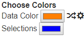 Clicking on a tile opens the scatter plot for the data between the two samples. The scatter plot color is chosen based on the Data Color Option in the Top panel.
- Clicking on a tile also draws the Bland-Altman plot if you scroll down in the window.
- Ctrl+Clicking on a tile changes the color of the scatter plot with a random color.
Scatterplot Controls
- If r is 1, the scatter plot should show points along the diagonal of the scatter plot.
- If r is closer to 0, a more random pattern may be observed, or points may be more towards the axis.
- Placing the mouse over the scatterplot points shows the Glycan or sample which is compared between the two samples. If it is a glycan on the point you can view the structure by opening the Glycan Structure drawer and placing the mouse over the point. Ctrl+click on a point can add the structure to the Selected Structures for viewing together.
- Clicking on the points in the scatter plot allows you to track the changes in binding for different sample comparisons. When you click a point on the scatter plot it will give a orange outline to that point. If you click on another tile to open another scatter plot, the same points will be highlighted for the new scatter plot.
Interpretation of the Pearson Correlation Coefficient (r)
The r-value is calculated by plotting the data for one sample (or glycan) vs another sample (or glycan) to yield a scatter plot. Based on the direction of the scatter plot and how linear the relationship is, the r-value can range from -1 to +1.
The r-value can be interpreted as follows:
- A value of +1 : indicates perfect positive correlation. This means that the two samples (or glycans) show identical binding patterns across the data set.
- A value of 0 : indicates no correlation. This means that the two samples (or glycans) show no similarity in binding patterns across the data set.
- A value of -1 : indicates perfect negative correlation. This means that the two samples (or glycans) show perfectly opposite binding patterns across the data set.
Bland-Altman Plot
Bland-Altman plot is useful in visualizing the agreement / similarity between two assays. Bland-Altman plots dig deeper than correlation and can highlight outlier glycans which show significantly different binding between samples.
To produce the Bland-Altman Plot for a pair of samples, simply on the tile for the pair of datas in the correlation map and scroll down in the browser window.
Like the Scatter Plot, the Bland-Altman plot points also uses the color selected in the Data Color option above.
The solid line shows the mean, while the dotted lines show the +/- 1.96 SD